Kroger Checkout Redesign
Company: The Kroger, Co. | Date: January 2021
As part of a larger initiative for Kroger to offer their own delivery service, Checkout needed to be completely redesigned to be able to handle the new requirements for Kroger native delivery services.
Role: Lead UX/UI Designer, User Researcher
Technology Used: Sketch, Invision, UserTesting platform
Background
As Kroger finds and implements new and innovative ways to better serve our customers, we keep adding to our current experience without re-considering the experience and all the features as a whole. With the addition of Marketplace and Ocado, Kroger is outgrowing our current Checkout Scheduling experience. The experience feels as if its pieced together rather than one cohesive unit. The objective for this initiative is to identify all of the current pain points that customers experience on the Scheduling page today, review and/or conduct research as needed, and develop a new design that fits within Kroger’s new Design Style Guide while also making a better experience for our customers.
User and Competitive Research
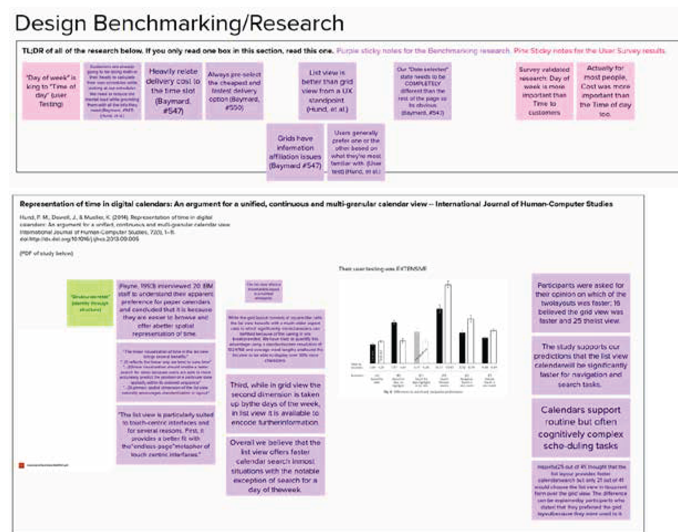
I also dove deep into Baymard to look at their guidelines, benchmarks, and other research for everything related to Cart and Checkout.
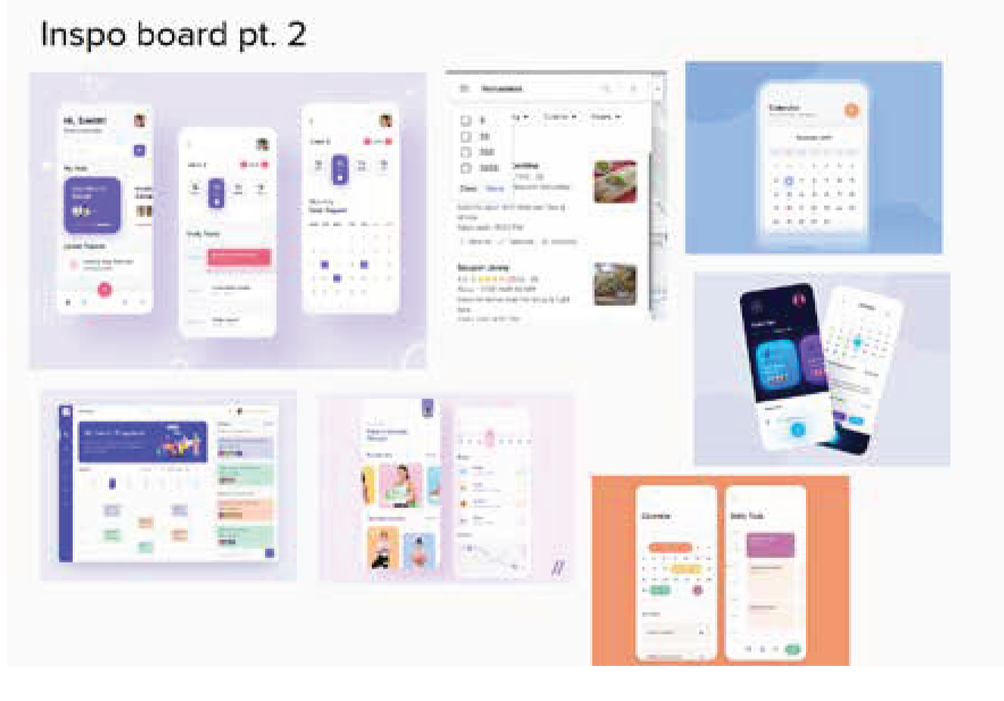
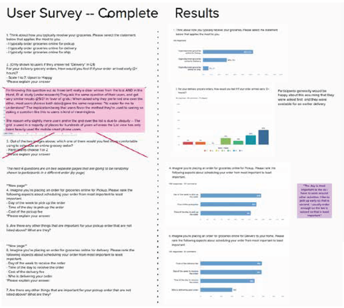
With all of this research on how customers expect a checkout experience to go, I also ran a user survey to gather specific answers from Kroger customers on how they receive their groceries, and more specifically, how they choose what time of day to pick up or have their groceries delivered.
Considering this was the first time I ever designed a Checkout experience from the ground up, I took my time to do a LOT of research to make sure I understood the most important parts and experiences of ecommerce checkout.
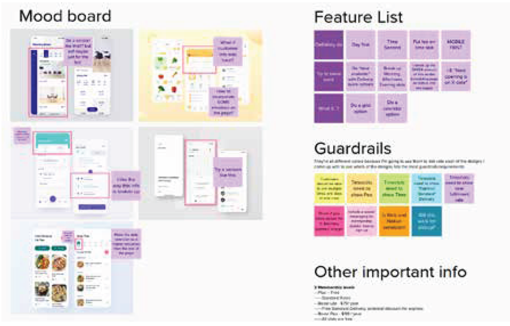
At the end, I distilled all my findings into a comprehensive Feature list, the Guardrails I’d need to design in, and other business rules I’d need to account for.
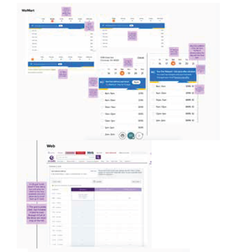
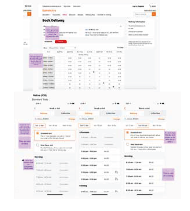
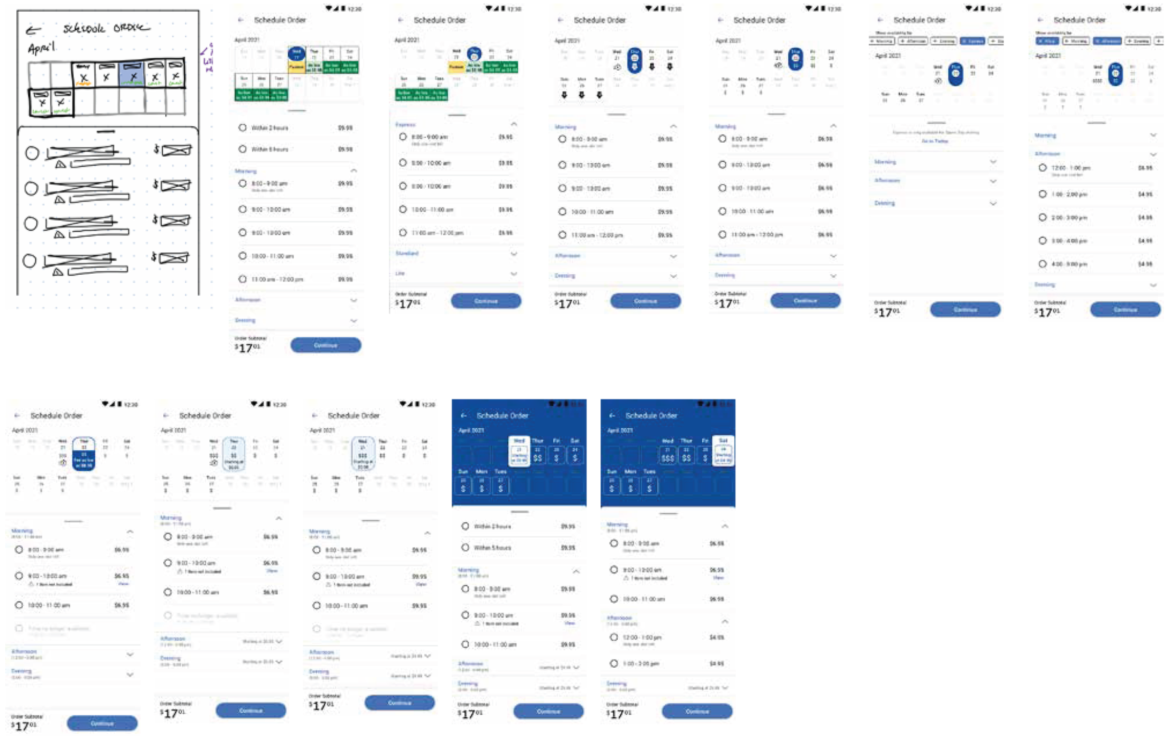
Design Iterations
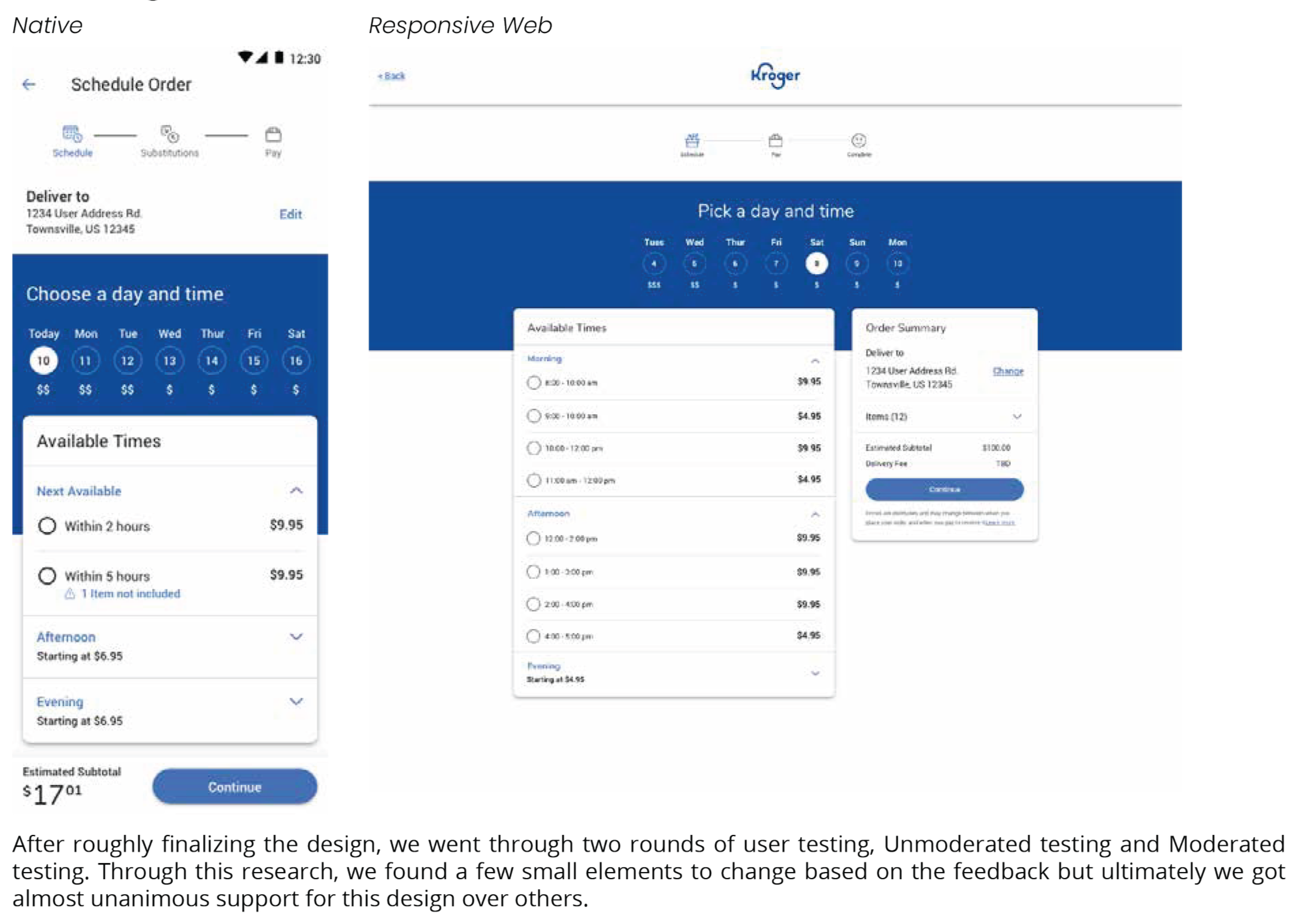
Final Designs